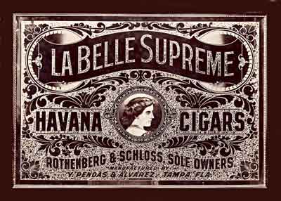
I decided to create a large sign. It is 61" x 42" and is of 1/4" standard plate glass with a 2" bevel all around. It was custom ordered from Western States Glass at the tune of $147.32.

The glass was coated with asphaltum varnish and allowed to dry. The stencil was weeded, transfer taped, and applied over the varnish. The glass was then sandblasted and the vinyl mask was removed, molten glue was then flowed over the sandblast and just up to the varnish. A couple of personal notes on glue chipping:
1) I just clean the glass with glass cleaner prior to the asphaltum varnish. I think that over cleaning the glass keeps the asphaltum from sticking as good.
2) Of all the different masking materials I've used, I like Venture Tape's 4 mil white Sandblast mask. It seems to stick good to the asphaltum and hasn't "blown" in the sand blasting process.It also peels easy after sandblasting. I prefer to weed the stencil prior to application rather than after it's stuck to the glass.
3) After flowing the glue on, I go back and cut the glue any where it has bridged, or radiused around a sharp corner. Actually, I go back and put a small cut at every corner thats 90 degrees or less. That includes on all the lettering. It's my belief that doing this little extra step ensures sharp points and corners.
4) While flowing on the glue, I found that I missed one dot in the design that didn't get weeded, or sandblasted. I took my electric micro engraver and etched in the dot and put the glue on. This technique could also be used if there were a few stubborn spots of asphaltum that didn't get blasted off.

We were experiencing some very dry weather (25% humidity) and the glass was half chipped by 7:00AM, just 17 hours after applying the glue. I rolled it out into the sun and it finished by 2:00PM.

I cleaned off the remaining glue and the asphaltum varnish. This is how it appeared from the front. Some additional notes:
1) After it appears to be done chipping, I go around and lightly tap off the remaining glue with my exacto knife and brush the whole thing down.
2) Next, while it's laying flat, I flood it with water. Then I cover it with a layer of flat paper towels over the entire surface. After it has soaked for about 30 minutes, I lightly scrape off the swollen glue with a razor blade. Then I dry it all off.
3) I then flood the surface with paint thinner and let it soak for about 10 minutes. Sometimes I scrub it around with an old bristle brush. I then wipe it all off with paper towels. It's my belief that if you've chipped in a hot booth for an extended period of time, the asphaltum gets baked on and is much more difficult to remove.
4) After cleaning with the paint thinner I spray it with some Quick Release Agent. This seems to pull up any asphaltum that got down into the crevases of the chip. I then clean it with glass cleaner, both sides.

I reapplied some portions of the mask and silvered the whole thing. Using Calon II computer cut vinyl, I masked off several of the areas I didn't need to be silvered (see the red mask from the front in the next photo). The text at the bottom of the sign was masked right up to the edge of the glue chipping. The panel and center ornament's mask was inset slightly (already in the art) which gave me a silver bright line. Although the "La Belle" text got silvered, it will be cleaned off and gilded. These areas of mask didn't want to stick to the glue chip and lifted off during rinsing. (The correct way to do it would have been to edit the file, deleting the text and center ornamentation and just keep the block shapes.) I cleaned the glass real well prior to applying the vinyl, then cleaned it carefully again afterwards. The red areas seen in the picture above are just areas where the silver didn't deposit on the vinyl. The rest of the red vinyl is covered with silver. A few notes:
1) I cleaned the glass real good with glass cleaner and inspected for any small glass chips that needed to be popped out. I then cleaned it real well with an ammonia and whiting mixture.
2) I placed the vinyl stencil pieces, and carefully cleaned it again with the ammonia and whiting as I had touched the surface when applying the stencil. After cleaning, I gave it a full rinse with tap water.
3) I tinned the entire surface (32oz. of tin solution) and swabbed the tin around with a ball of cotton. Then I fully rinsed it with tap water followed by a rinse of distilled water.
4) I mixed up about 60 oz. of silver solution and quickly poured it over the entire surface. It went down quite evenly. I mixed another 30 oz. of solution and poured it on the areas that appeared a little light and all around the edge. After deposition, it was rinsed with tap water.

Here's how it appeared from the front after silvering. The red areas are the vinyl I reapplied which automatically defined many of my bright lines.

I backed it up with asphaltum varnish then proceeded to weed out the stencil. The white areas are where the vinyl stencil was. Previously, I would have silvered the whole thing and hand painted all the outline work shown above. There's quite a time savings in this alteranate method. Next will be some gold gilding.

I found this oil painting on ebay which will work well for the center pictorial. It's on it's way from England, not bad for $53. ...how do they do that? (ebay seller ID: dandwart)

Okay...sorry to keep you waiting. Today I water gilded the main copy and the ornamental center ring in 23K gold. As usual, gilding over glue chip, it took two water gilds and a surface gild. The first water gild, I gilded with full leaves. The second gild, I gilded with half leaves and really only concenterated on voids in the bright line area. The third surface gild was over the entire chipped portion of the letters and the full ring. I then gilded it with composition leaf and backed it up with Fine Gold Ochre backup. I then cleaned the excess gold using a small soft shoe brush I snagged off ebay. The brush thing works great for removing the excess leaf and I won't be going back to the former method. Prior to gilding I painted a black outline seperating the gold and silver gilds at the center ring. It probably would have been better, and more cost effective, to angel gild the gold first, then silver the whole thing. ...but...

The next step was to add a black outline and a black drop shadow to the main copy letters. When painting in the colors on the lower text, I'll paint them with one big block of color. This block of color will show through the clear glass giving the individual letters their color. Seeing how asphaltum varnish redisolves with any type of solvent based paint, I will give the entire sign a good coat of spray shellac, all except the center pictorial circle which I want to remain true clear glass. I will mask off the center circle with a disk of static cling vinyl.

After a good coat of shellac, I blocked in the colors for the secondary text. I did a blend of red to dark blue on Havana Cigars, and dark Prussian Blue and Black on the smaller copy at the bottom. After the blended colors had dried, I painted over them with the middle value color.

Here it is from the front with the colors blocked in. All that remains now is the background for the main panel, framing and pictorial installation.

Rick Glawson spoke of a production technique employed by Rawson & Evans in which they airbrushed a black glaze onto the ends of various panels followed by backing the whole area with a single block of color. The black fades changed the tone of the color to appear as a blend. I had never tried that technique until now. So I airbrushed a black glaze, consisting of clear and black fibroseal, in both end areas of the panel. This will give me the look of a blended color with the application of just a single color!

After the airbrushed sections were dry, just to be on the safe side, I gave them a shot of shellac. I then blocked in the green color I had mixed up.
A little advice, when creating period type replicas such as this, use japan colors. The colors are nicer and truer to that time frame. Leave the One- Shot for your other projects. Rarely do I use a color right out of the can (tube), I'm always mixing them to a shade or tint other than the "right out of the can" color.

Okay...here it is from the front! I turned it around and was pleasantly surprised how nice the blended panel came out. I think I mixed just the right color, and the airbrush technique really worked good. It very much looks like a period piece! These little pictures don't really do this piece justice, it really is looking georgous! ... table saw time tomorrow.

I decided to build my own frame for this one. I purchased some molding, corner details, and some plywood over at Lowe's Home Center. I cut a big rectangle out of the plywood and affixed the molding and corners to it. I gave it it's first coat of finish...now it's drying out in the sun.

Well I finished up the frame, postioned the pictorial, and slapped the rest of it together. All in all this project came out pretty sweet, minimal learning curve, and no rework! Another glass sign to enjoy. I hope you enjoyed this post on this sign's creation.

Well I decided a few more screws in the back of the frame wouldn't hurt. It would hurt if it fell apart while hanging on the wall. I went over to Home Depot and figured out some bracketry and hung it up. Now it's done.
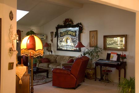
This sign was too large to hang in my old home, so I had it up in the shop. But now, it fits nicely on my living room wall!


 Denver Chapter of the Letterheads