Posted by Mike Jackson on November 12, 2003

Tony SegaleHi all,
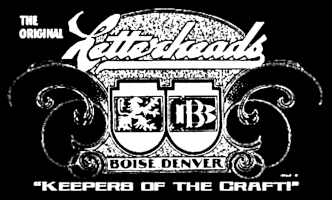
I made this image the other day, then colorized it tonight. The panels and the artist's palette are from the new Americana Collection and the lettering at the top is the one you can download from the main page. We always called it Shaky Script by John Frazier.
Just a side note on the image above:
When I was adding colors to the lettering at the top, I tried several different hues and even a couple of different colors. I wanted it to show up and be one of the two dominant messages, but not overpower the rest of the design.
As it neared completion, the finish reminded me of a "grand" experiment from a long time ago when we were making our R sample wall at the old shop. Since we were always creating "matte" centers on reverse glass using such products as Damar varnish, I thought we might try a matte center on a surface gilded flat sign. I'd allow for a burnished highlight edge of gold, then texture the surface with sand smalts. Sounds good, right?
Well, we did the sample using three cuts in the computer cut letter stencil. We peeled the centers first, applied the adhesive and poured the sand. After it dried, we peeled the burnished outline and sized over both parts. From this point, it was a little messier. The sanded areas retained some size that was not as cured as the flat edge. We could basically solve that on later attempts by gilding just the sand section before peeling the second edge...but never tried it. Anyway, the sand section required a LOT of gold to fill all the section--maybe three times the normal amount. Worst of all, the gold was "dead" in the matte areas. It just didn't have the 23k look and feel and it WAS 23k gold. The burnished edge looked fine. We peeled the last cut in the stencil and hand painted the outline back in. In the end, the letter looked Okay, but not great and not worth the time and expense.
So, the lettering finish in Letterheads above now has some meaning! At least it does for me.
Mike
There's a bit of a blatant plug here, but maybe you can forgive me!
Golden Studios - Americana Collection
http://www.goldenstudios.com/index.htm
Mike Jackson
Raymond ChapmanConsider yourself the "Unforgiven".
No forgiveness necessary for the amount of time you put in to produce all those images on that fine CD collection. Your plugs aren't close to blatant. In fact you have every right to stand up and shout your personal ad at any gathering. And so would someone else who took the time to produce a collection or how-to-book or anything else similar that continues to elevate the skill level of each one of us in this craft.
Of course, by the same token, anyone who wants to blatantly promote anyones work by copying and distributing it cheaply, deserves a public flogging, tar and feathering.
Put my order in for an XL or two or three.
Tony
You're forgiven.
Robin Sharrard
Mike Jackson T-ShirtsThis would make a Kool t-shirt!
Hi Robin,
I'd give this design to anyone wanting to make and handle the T-Shirts. I have my hands full right now already! A few people might want them...hard to say how many. If someone did take on the project, I'd love to see excess proceeds go to Rick Glawson's Rawson & Evans glass headed to the Museum.
Mike Jackson
Ron, Sacramento, CA - New T-Shirts
Robin SharrardRobin, be sure to post a nice "B I G" notice here so we can all get our orders in, as well as spread the word to those who would be interested, but don't "hang out" here.
Thanks for picking up the ball and Mike great idea for proceeds.
Ron
Mike JacksonMike, It would be an Honor to take on this task! I would not hesitate to donate the "...excess proceeds to Rick Glawson's Rawson & Evans glass headed to the Museum." I will contact you for further discussion...Robin
Robin Sharrard - T-Shirts Coming SoonWell, that's great! I'll get the file ready and send it to you ASAP.
Thanks! (I'm sure the American Sign Museum would thank you, too)
Mike Jackson
Thank you Mike! This will take a little time to get the artwork together and workout some of the particlars...plus the normal day to day pay the bill stuff...so please hold your e-mails until I can get an information package together that takes care of all your questions. Robin
 Denver Chapter of the Letterheads